Time-series data is a familiar concept in the observability world. Every time an application or a system adds a record to a database or log file, it includes a timestamp that represents the precise time it created that record.
The resulting table or file typically contains vast numbers of such records, each one representing some information at a particular point in time.
Querying this information is also straightforward and can answer questions, like ‘what was the particular value of a field at some point in time’, or ‘what was the average value of a field over a specified time interval?’
Some important tasks, however, aren’t nearly as straightforward. For example, asking a simple question like ‘how long did it take a particular user to log into a web site?’ would require a surprisingly complicated SQL query – one that not only takes an inordinate amount of time to craft, but is also likely to have a difficult-to-find bug.
In the first two articles in this series, my colleague Jason English and I defined the notion of ‘quality of experience’ (QoE) and discussed how to operationalize telemetry data to achieve this QoE.
However, there’s a catch: point-in-time data is insufficient for evaluating QoE. Instead, organizations must leverage continuous time.
Continuous Time and Time-State Analytics
The shift from the traditional point-in-time, relational approach to time-series data to the continuous-time approach requires a rethink of how we organize and query data.
Continuous time is the key to this rethink. Rather than breaking up time into discrete records with timestamps, we must think of time as a continuous entity.
Instead of traditional database queries that provide filter and aggregation operations over tabular, time-stamped data, we need stateful, context-sensitive analyses over event streams with continuous time semantics.
The core abstraction of this new approach to data is the timeline. Instead of tracking point-in-time data, timelines must track changes of state of values in continuous time.
In other words, for our question about the time it takes to log into a web site, we have a set of events: the user begins the login process, the user hits the ‘log in’ button, the log in process is complete, and the user sees a web page showing that they are logged in.
Each of these events represents a change in state, and the user’s QoE depends entirely on how much time it took to move through this sequence of events.
Enumerating the Timeline Types
There are, in fact, three different ways for dynamic processes to vary over time. These timeline types include:
-
- State dynamics – each state has a value at each point in continuous time and changes at discrete points, as the example above illustrates.
- Numerical values – values that vary continuously over time, for example, how much time a user has to wait while a video feed buffers on their device.
- Event data – data that captures a sequence of discrete events, for example, user state updates, content delivery network (CDN) updates, and events that represent the user seeking additional data.
Based upon these timeline types, queries for time-state analytics intuitively follow timeline semantics, as the figure below illustrates:

Figure 1: A SQL-like query for time-state analytics (source: Conviva)
The query in the figure above returns the total duration of buffering after play has started and includes only the buffering that is not immediately after the ‘seek’ action..
Without the timeline abstraction that leverages continuous time and time-state analytics, it would be impossible to build intuitive queries like this one that return the user’s QoE at a point in time.
Building the Visual Timeline Abstraction
Relational data depends upon the geometric abstractions of logical data models and their tables. While these abstractions are well-understood (as is the structured query language that leverages them), they are inappropriate for representing timelines and the time-state analytics that extract useful information from them.
Instead, we need a new type of geometric abstraction that lends itself to timelines: the directed acyclic graph (DAG).
DAGs are a well-understood element of modern graph theory. A common example of a DAG is how formulas work in Excel spreadsheets: each formula performs a calculation that includes values in other cells, including cells that themselves have formulas in them. The set of all cells with formulas connecting them is a graph.
Such graphs can be arbitrarily complex, but they must follow one basic rule: they can’t loop back on themselves. Make this mistake in Excel and you’ll get an error. In other words, such graphs are both directed and acyclic.
We can express any end-to-end query on a timeline as a DAG. As a result, we can build a geometric compositional language based on DAGs that connect the three timeline types listed above.
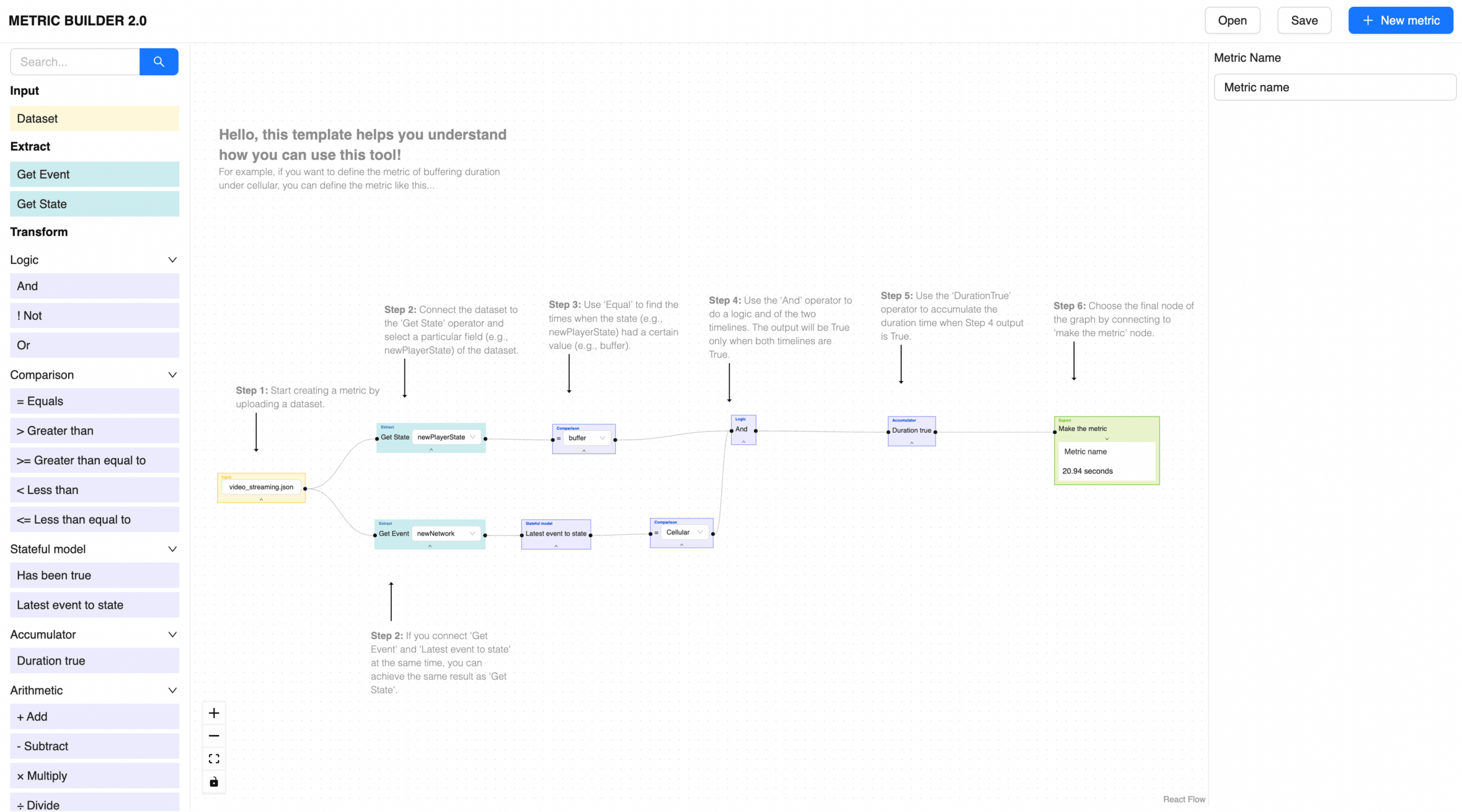
Conviva, in fact, has built such a visual language it calls ‘Stateful Event Analytics Made Easy,’ or SEAM-EZ. The figure below illustrates a timeline-based metric written in SEAM-EZ:
Figure 2: A visual representation of a timeline DAG in SEAM-EZ (source: Conviva)
The figure above illustrates how someone would define the buffering duration metric for a particular streaming channel, in this case cellular.
This intuitive no-code interface shows how simple it is to create DAGs that provide the stateful metrics organizations require to ensure that their users’ QoE meets its goals.
The Intellyx Take
Most operational tools are point-in-time: what is the log entry, metric value, or other telemetry at a particular moment.
User experience doesn’t work this way, as it typically has a time component: how long did it take to log in? How long until a page or app responded?
Solving this problem requires a different way of structuring, tracking, and organizing operational data. The problem runs deep: the tabular abstraction underpinning relational databases and SQL falls short.
To solve the problem, Conviva has created a new timeline abstraction that represents all event stream data as timelines with a set of timeline operators to compute stateful metrics.
The proof is in the visual representation above. The underlying details are complex, but the geometric timeline abstraction offers a simple, but powerful approach for calculating the stateful metrics essential for QoE.


